Thank you for choosing to work with our last idea. Nice that you have enjoyed it.
We know that we are too close to our presentation date, but we have some suggestions, and we think you are capable of doing them until tomorrow — so we can produce our promotional video.
Our suggestions:
- We would like to see your references for the layout. We think that it lacks some brazilian identity; we feel that its visual looks a bit dull. It has some elements that doesn’t connect with our culture: the stars, the pizza drawing, the shell.
- We can’t understand what is written on the placemat, or even the meaning of each element.
- We miss a packaging and a simplified guide about the purpose and how to use the placemat kit.
- What material you think we should use for the prototype? Bamboo won’t work, because of the markers.
- Please, make it on Illustrator or Figma, in vector. It’s the industrial standard for printing.
We enjoyed the idea of sewing material, but the idea is too close to what we have suggested. Perhaps you could refine it and make it more authentic.
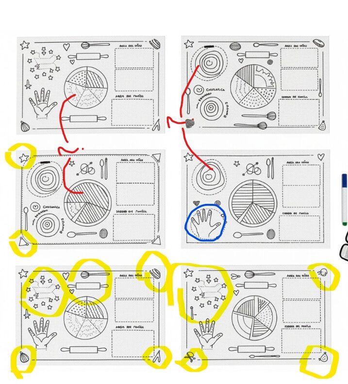
- Yellow: visual resources that are weird or not allign with brazilian culture;
- Red: things that we dont understand the purpose, making even more confusing for the client;
- Blue: good idea, make it clearer the purpose.
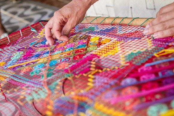
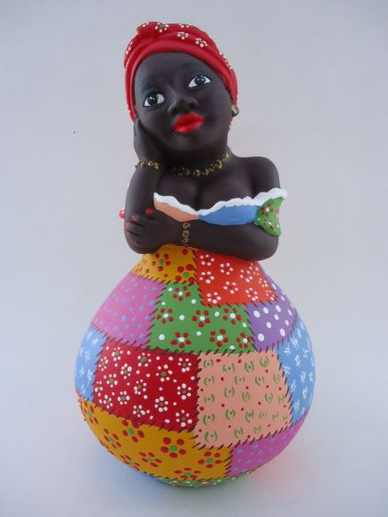
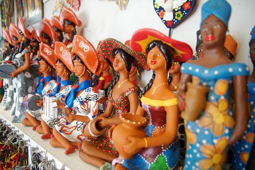
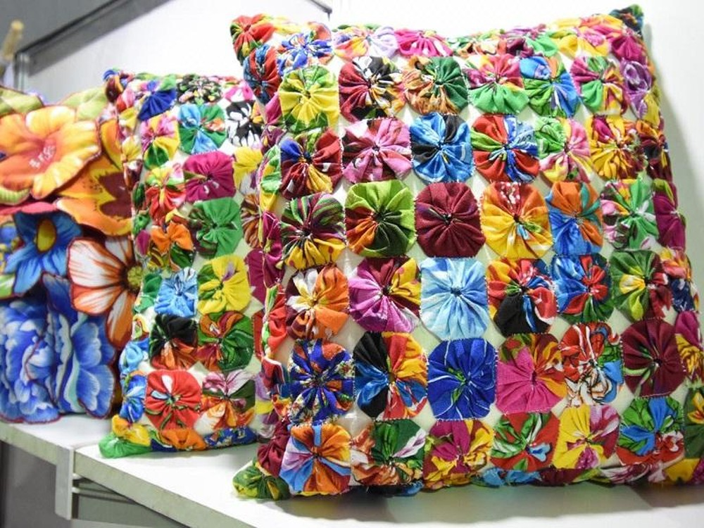
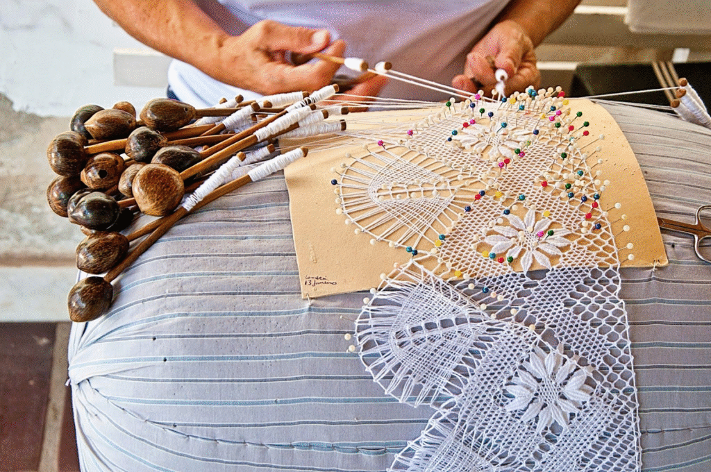
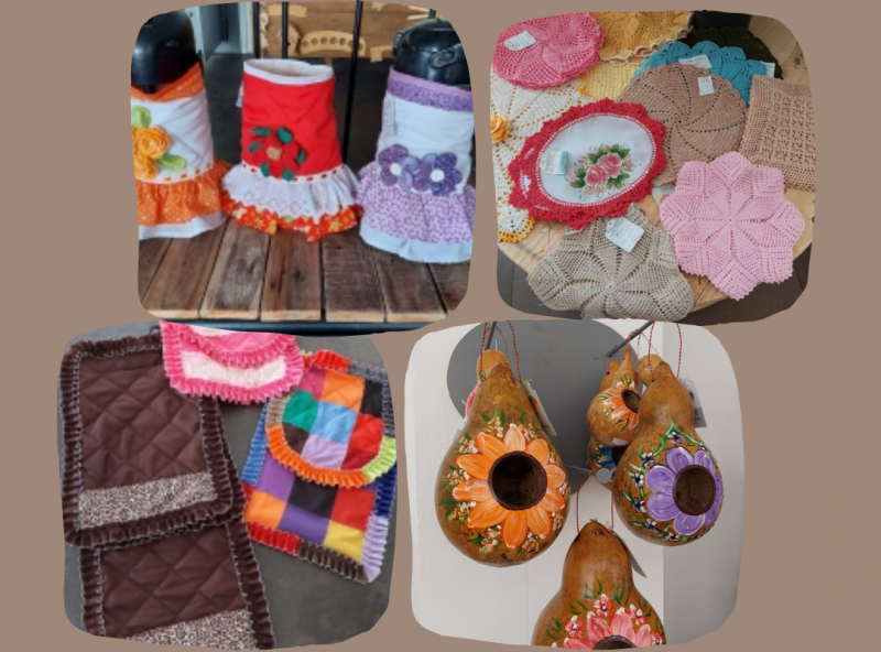
We know we are short in time, but we are working together. Above, we gathered some visual references for you:
- Artesanato, Renda, Cordel


A GENTE CONFIA EM VOCÊS!!!!!!! (We trust you <3)

