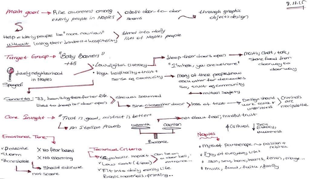
As Team 11, we analyzed the design brief prepared by Team 19, which explored the cultural, social, and emotional context of elderly communities in Naples and the challenges they face with door-to-door scams. Based on the insights, scenarios, and symbolic elements presented in the brief, we developed nine concept ideas that reinterpret local traditions and visual culture into protective, awareness-building design proposals. In the following section, you will find the initial design concepts we created in response to the brief.
Elif Ceren Uçar:
IDEA I– The Eye of Parthenope
This concept began by studying the Baby Boomer generation and identifying visual elements they naturally recognize from their past. I chose to work with familiar 1960s patterns because these graphics shaped the visual memory of this age group, making them an ideal foundation for a design aimed at elderly users.
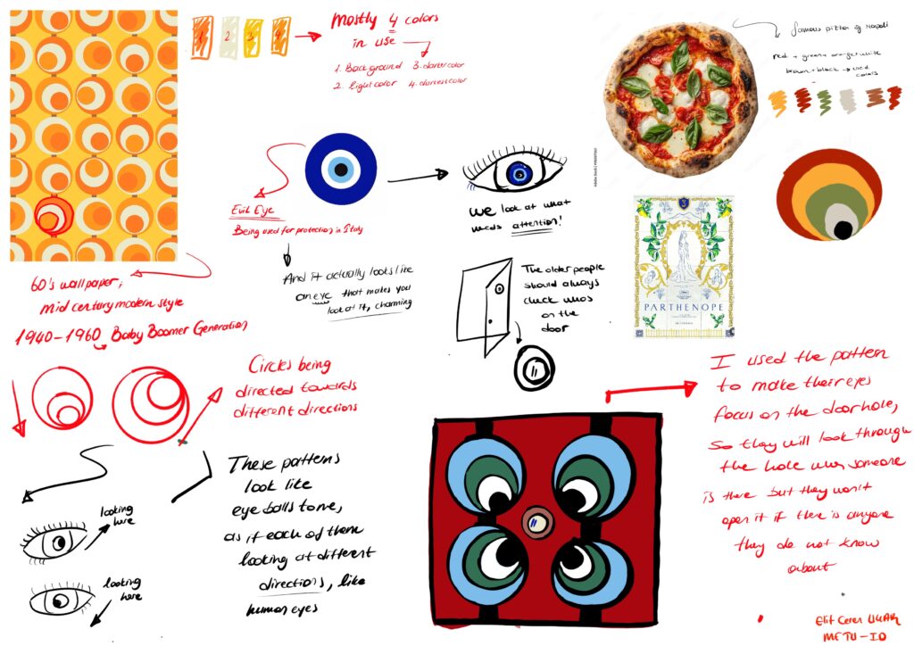
I used the characteristic triple–circle forms of 1960s wallpaper patterns, which visually resemble eyes, and connected this to the protective eye symbols found in Italian and Turkish culture. I turned these eye-like motifs into a composition placed around the door peephole, positioning four circular graphics so they appear to “look toward” the hole. This arrangement draws the user’s attention to the peephole before they open the door.
The color palette combines tones familiar to this generation—red, green, orange, brown, and black—with added blue accents to make the design more visible. I named this concept “The Eye of Parthenope,” inspired by Naples’ mythological protector.

IDEA II– Il Limone della Prudenza (caution lemon)
This concept uses a familiar and beloved symbol from Neapolitan culture—the lemon—to deliver a gentle reminder about caution. Because lemons appear frequently in local decoration and are instantly recognizable to older users, they provide an accessible visual language to communicate the idea that things are not always what they seem.
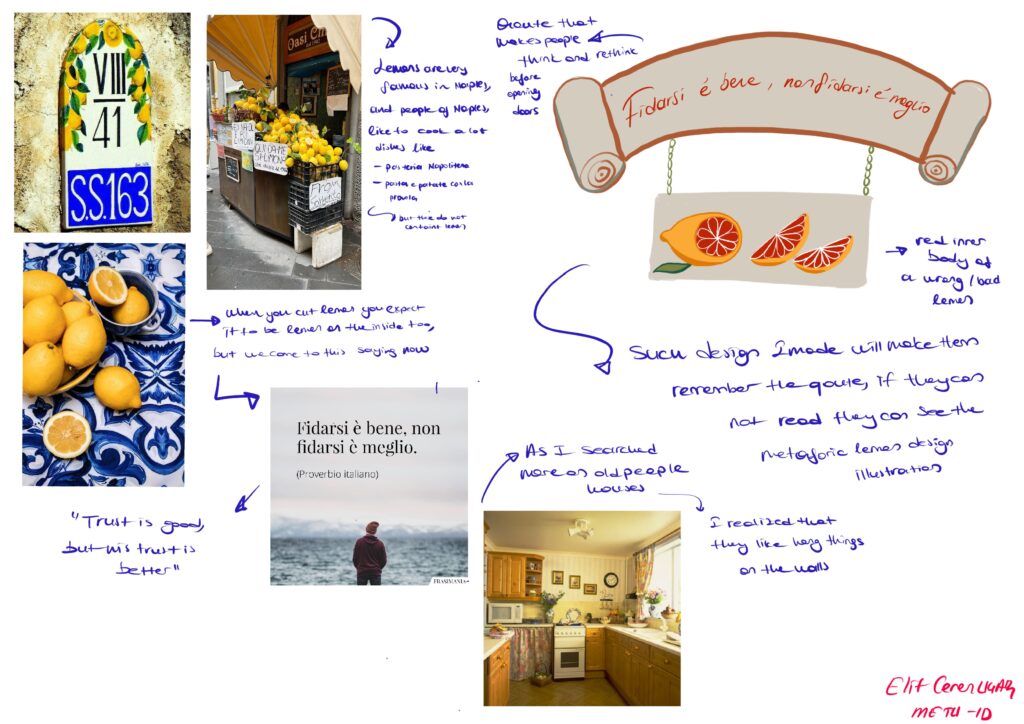
For this idea, I focused on the symbolic value of Neapolitan lemons. Although they are not part of every traditional dish, they are widely used as decorative elements in local homes. I paired this symbol with the Italian proverb “Trust is good, but mistrust is better,” emphasizing the idea that appearances can be misleading.
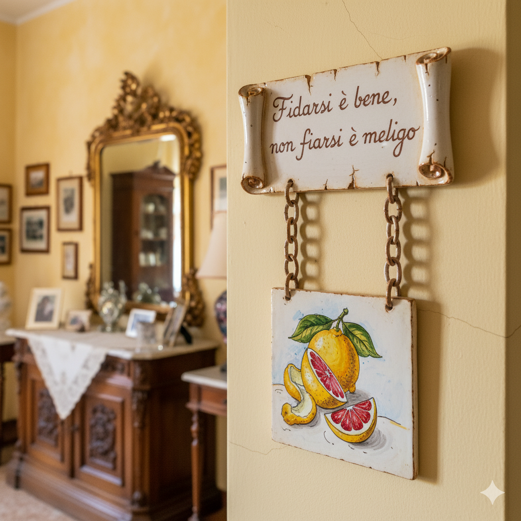
Just as people expect the inside of a lemon to be yellow because the outside is yellow, elderly individuals may assume that the person at the door is who they claim to be. To challenge this expectation, I illustrated a lemon with a red interior, symbolizing caution and the unexpected.
The drawing is placed on a decorative tile—a common element in older people’s homes—so they can hang it without disrupting their familiar environment. The tile includes both the illustration and the proverb, ensuring that even if the text is hard to read, the imagery communicates the message clearly.
By combining a cultural symbol with a protective message, “Il Limone della Prudenza” encourages users to think twice before opening their door.
IDEA III – The San Gennaro Medallion
This concept is built around one of the most sacred and unifying symbols in Naples: San Gennaro and the miracle of his blood. Since this ritual is deeply meaningful to the community, I wanted to create a protective object inspired by this shared belief—something that reminds elderly users of the value of their home every time they approach the door.
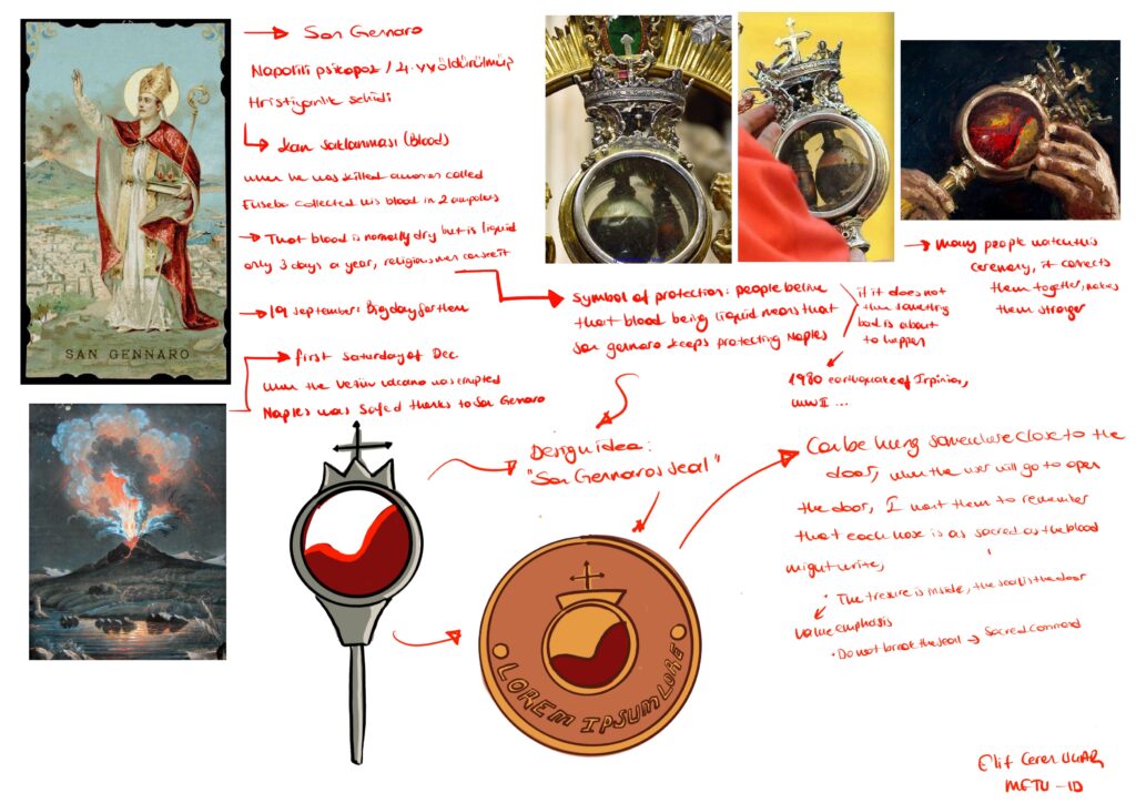
This idea draws inspiration from San Gennaro, whose blood is preserved in two ampoules and believed to liquefy miraculously on specific dates, especially September 19 and the first day of December. These moments are celebrated as collective rituals of protection and faith within the city.
Based on this, I designed a small hanging medallion to be placed near the door. When someone moves to open the door, they encounter this medallion and are reminded that their home is as precious and sacred as the blood they believe protects Naples. This gentle reminder encourages them to be selective about whom they open their door to.
A phrase such as “The treasure is inside, the seal is the door” strengthens the emotional and protective message of the design.

Zeynep Duru Tırman:
Idea I:

This design combines the traditional majolica ceramic language of Naples with a classic key motif to create a visual pause at the entrance of the home. Instead of using talismans or sacred symbols, it introduces a simple key icon that represents the idea of domestic safety.
The object serves as a gentle, culturally grounded reminder that encourages the user to pause and think reflexively before opening the door, helping them stay more attentive to unfamiliar visitors.
It blends naturally into the home environment and is perceived not as a warning device, but as a seamless part of the interior decor.
Idea II:

This design brings together traditional Neapolitan majolica ornamentation with culturally familiar protective symbols such as the eye motif and the red corno. While these elements are commonly associated with warding off bad luck or unwanted intentions, here they are reinterpreted as part of a decorative object placed near the entrance.
Rather than functioning as a literal warning or a sacred talisman, the piece aims to create a subtle moment of awareness as the user approaches the door. Through its vibrant colors, hanging forms, and recognizable cultural references, it blends naturally into the home environment while gently encouraging attentiveness toward unexpected visitors.
Zehra Yılmaz:
Idea I:

This handcrafted ceramic decorative plaque features a round shape and an authentic appearance provided by a fine craquelé glaze. The central motif depicts a stylized volcanic mountain (likely Mount Etna) rendered in deep blues, greens, and orange, positioned behind a small, welcoming house. Below the image, the phrase “CHIUDI PER CHI AMI” is inscribed, which translates to “Close [the door] for those you love.” This message transforms the piece, emphasizing the home as a sanctuary and a place for the protection of one’s closest affections. Finished with traditional border detailing and a rustic leather cord for hanging, this plaque offers a sincere and artisanal touch of Italian folk art to any space.
Idea II:

This decorative ceramic key holder features a large, red chili pepper (cornicello), a popular amulet used in Naples, as a symbol of luck and protection against the evil eye. The design includes a cheerful, crowned figure and a small representation of Mount Vesuvius, reinforcing its cultural origins and symbolism of abundance and power. The Italian phrase inscribed on it most likely means, “Do not open without trust/faith, THINK!”, offering a witty and cautionary reminder to the user to be thoughtful and careful before entering (or starting any endeavor).
Idea III:

This is a charming decorative ceramic plaque, featuring the iconic Italian Commedia dell’arte character, Pulcinella, surrounded by a vibrant, traditional majolica tile border. Pulcinella is depicted holding a red corno (chili pepper horn), a popular Italian luck charm, which reinforces the object’s protective nature. The humorous inscriptions read “CHI È?” (“Who is it?”) at the top and “SEI SICURO?” (“Are you sure?”) below, serving as a witty and unique welcome or cautionary sign for anyone approaching the door. With an additional corno charm hanging below, this piece beautifully blends Italian folk humor, artistry, and superstition, making it a distinctive and culturally rich accent for any home.
Hey everyone!
I wanted to check your design concepts, and I must say that they are really interesting for me! I really like each one of your design solutions, and how you combined those with cultural elements regarding to your brief, is really inspiring!
Thank you so much Burcu! Hearing such nice comments from you makes us very happy 🙂
Hi Elif Ceren, Zeynep, and Zehra, I’m Fortunatina Branno from Team 25 and I’m from Italy. I read your project and I find it very effective in addressing the issue of door-to-door scams targeting elderly Neapolitans. I really like how you used familiar cultural symbols and everyday objects to make protective warnings clear, accessible, and at the same time harmonious within the home environment.
Your approach intelligently combines safety, cultural memory, and awareness, turning a simple warning into an educational and reassuring experience. One suggestion: you could make some elements slightly interactive or tactile to increase attention and engagement. Congratulations, this is an excellent, complete, and thoughtful solution for the target group!
Hello, we appreciate your work as designers. However:
1. The majolica tiles you have included are already used in most homes; they are a typical item that many people, including the elderly, already have. They could be used as an accompaniment or support to the actual final solution.
2. We feel that it does not fully solve the problem of “scams”, as elderly people see this object more as a decoration than something functional for their safety.
3. We have noticed that the ideas proposed are very similar to each other, with only the aesthetics changing.
4. The colours chosen represent our culture and we like them very much.
Hi! We wanted to let you know that we truly appreciate the time and care you put into this project. However, we’d like to share some thoughts that might help refine the proposal. To begin with, the majolica tiles you chose are very familiar elements in many homes. Because they’re so common, they may be perceived more as a decorative object people already know rather than something new or functional. They might work better as a supporting detail rather than the central part of the solution. Another aspect concerns the goal of preventing scams, if an object is seen mainly as decoration, elderly people may not recognize it as something that can genuinely help them feel safer. This could limit its effectiveness. We also noticed that the proposed ideas are quite close to each other, differing mostly in their aesthetic rather than in the underlying concept. That said, we really like the colors you chose, they represent our culture well and convey a warm feeling.
Hi, girls! I really appreciated going through your proposal — it’s clear that you put thought and sensitivity into it. While reviewing it, a few considerations came to mind that I think could help you push the concept further.
The use of majolica tiles is certainly evocative and culturally meaningful, but precisely because they’re so familiar in everyday homes, they might risk blending in too much. Instead of standing out as a functional tool, they could easily be interpreted as a simple decorative choice, which might reduce their perceived purpose.
Thinking about the challenge of preventing scams, I wonder whether an object that looks primarily ornamental would attract the right kind of attention from elderly users. If its function isn’t immediately clear, it may not create that sense of reassurance we’re aiming for.
Another thing I noticed is that the three directions you explored seem to revolve around the same core idea, mainly shifting in terms of aesthetics. You might consider experimenting with more varied approaches to widen the range of possible solutions.
That said, I really liked your color choices — they carry a strong cultural resonance and add a warm, welcoming touch.
Good morning, we would like to express our appreciation for your design work. However, we would like to share a few reflections. The majolica tiles you introduced, although visually appealing, are already very common in many homes and represent a traditional element that most people — especially older adults — already own. For this reason, we see them more as an additional detail or a complementary feature rather than the core of the final solution.
We also feel that this type of object does not effectively address the issue of scams, as older people are likely to perceive it mainly as a decorative piece rather than something that contributes to their safety. Moreover, we noticed that the concepts you proposed are quite similar to one another, with the main differences being aesthetic. That said, we truly appreciate the color palette you selected, as it strongly reflects our cultural identity.
The concept is visually powerful, blending the traditional and reassuring base of the majolica with a bold, pop-art concentric circle pattern, which naturally guides the eye toward the central sensor. The integration of technology is so discreet it is almost invisible within the tile’s context. Although the aesthetic is a strength, there remains the risk that the object will be perceived only as decoration; it is crucial to ensure that the interaction (light or sound) clearly communicates its active security function.
i loove this project! The work shows a clear understanding of the cultural, emotional, and social dynamics affecting elderly communities in Naples, especially regarding the issue of door-to-door scams.
One of the main strengths of this project is the ability to translate contextual insights into a diverse set of nine concept ideas, each rooted in local traditions, symbolic elements, and recognizable cultural references.
The narrative is clear and professional, and the team succeeds in connecting research findings with design intentions.